Publisher
d’Escrivan
Eléonore
Valenciennes, France
Hosting
OVH
2 rue Kellermann - 59100 Roubaix - France
Contacts


Nami
Discover
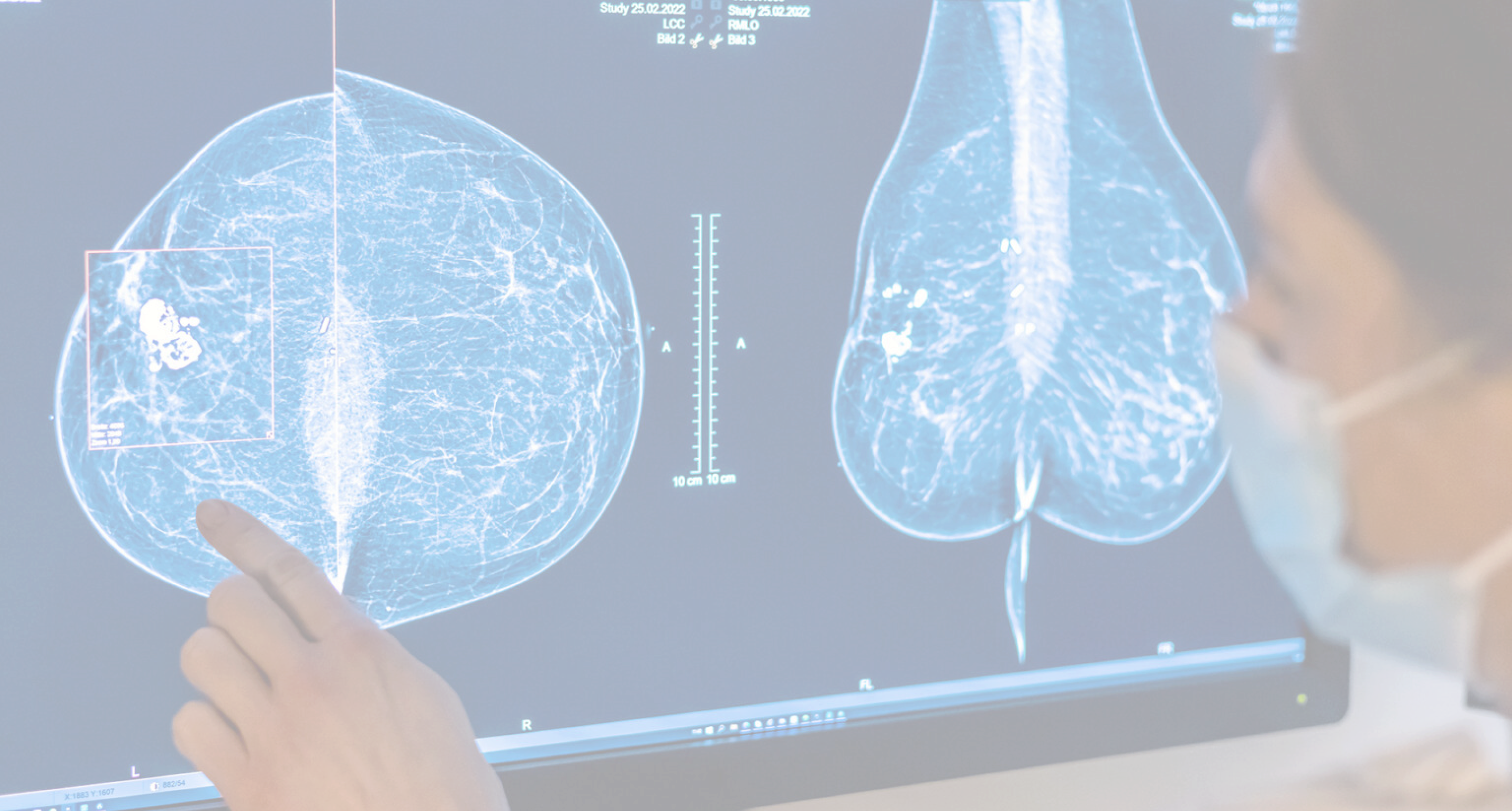
Only 46.3% of eligible women take part in France's national breast cancer screening programme. Yet regular screening prevents 150 to 300 deaths per 100,000 participants.
Getting women screened is an important public health concern.
Santé publique France / French National Authority for Health (Haute Autorité de Santé)
The team
Antoine Macrez
Manager, UX designer, UI designer
Amélie Ziatkowski
Manager, UX designer,
UI designer
Eléonore d’Escrivan
UX researcher
Anita Abadia
UX designer
Morgane Filleur
Manager, product designer
Parternship with Valenciennes’ public hospital (CHV)

“How can we transform
the sterile and anxious place that is women's imaging
into a welcoming space ?”
5 month - February to June 2025

At the hospital
2. During
the booking
8. During the test
4. Arriving to the women imaging ward
6. In the waiting room
7. In the changing room
9. After the test (Leaving the hospital)
10. Coming back for the results
Getting report (if good result you receive it at home without coming back)
1. Before taking
the appointment
5. During
the recording
3. The day
of the exam
Insight
Stress :
The 1st exam is stressful due to the fear
of unknown. It is often perceived
as problem-focused rather than health-affirming, adding to the anxiety.
Comfort :
Although patients may grow accustomed to the process over time, comfort
does not improve. Imaging environments remain cold, impersonal,
and often disrespectful of privacy.
Communication :
A lack of clear, empathetic medical communication can lead to stress
and guilt, with some announcements perceived as abrupt by patients.
Waiting :
Waiting for results is a major source
of anxiety, especially in hospitals,
where reception and waiting
conditions are often inadequate.
Lack of information :
Limited access to medical results
full of technical vocabulary, causing frustration and uncertainty.
User research
We combined field observation on the ward to see the reality for ourselves, guerrilla-style interviews with patients in the ward, staff interviews to bring the whole team into the solution, a survey posted in the waiting room for quantitative data, and interviews with patients and associations
from other hospitals to widen our perspective.
Medical team point of view (based on 17 answers)
Human contact
Patient point of view (based on a survey with 36 answers)
Co-design
I conducted a co-design session with patients from Jeune&Rose, a young women's cancer association, while my teammates ran one
with the women's imaging team.
For each axis, we presented our current direction, then had patients write
their own ideas on post-its and vote
with stickers. That's how the idea
of two waiting rooms, chatty or bubble,
came directly from patients, building
on our own intent to adapt the experience
to how someone feels that day.
3 Axis
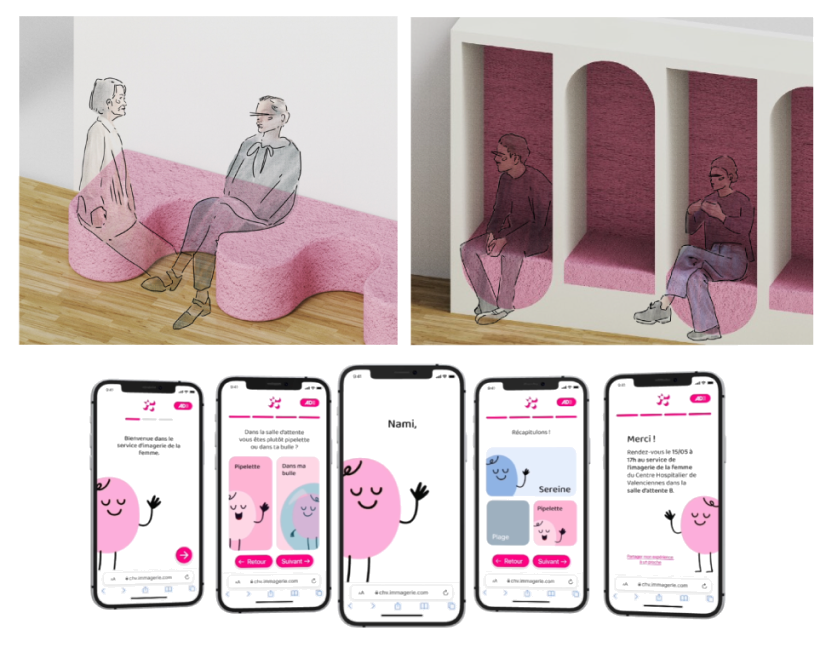
Nami :
An emotionally adaptive web app and spatial concept that tailors the care experience based
on a patient's real-time stress levels. It directs patients to either quiet ("Bubble") or social ("Chatty") waiting areas, while enabling loved ones to send comforting messages directly
to the exam room.
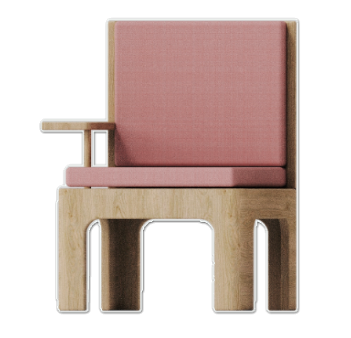
Almara :
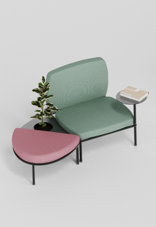
An ergonomic furniture system designed to soften and harmonize cold hospital environments across waiting, changing, and examination rooms.
It features comfortable, hygienic 1-to-3-seater benches with integrated shelves and privacy screens optimized for narrow hospital spaces.
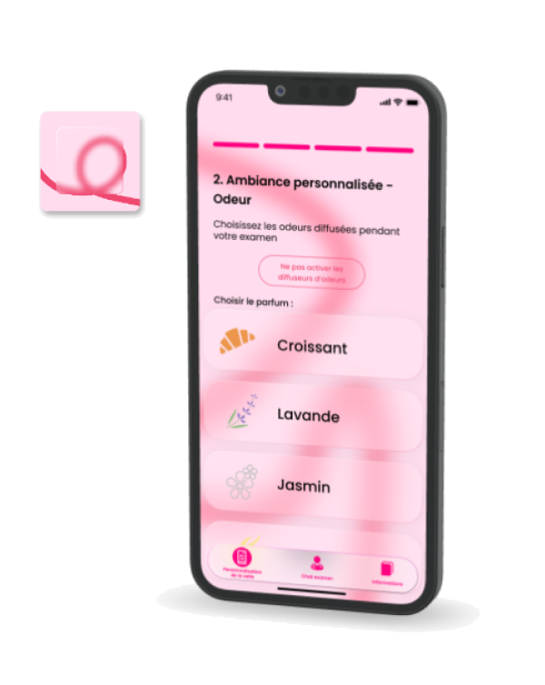
ViaCare :
A health app that gives patients direct control
over their appointment by letting them
pre-customize their exam room's lighting, sounds, and scents. It reduces anxiety through explanatory videos and practitioner profiles, while automating atmosphere setups to save time for medical staff.
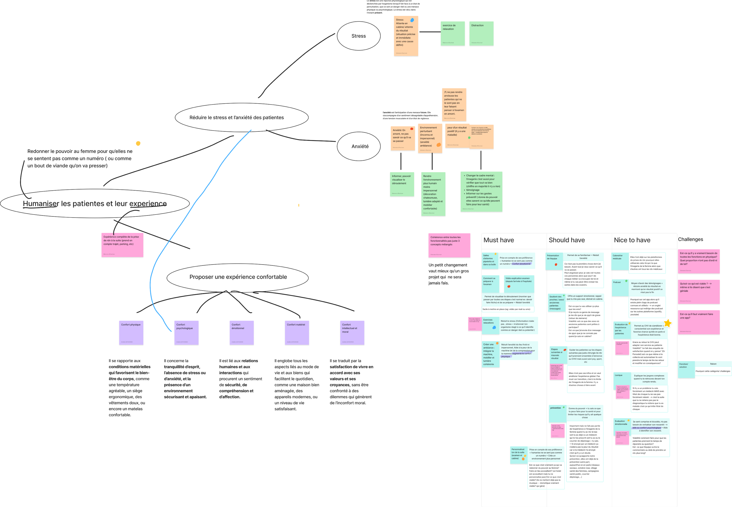
For our final concept, we decides to develop our Nami axis while implementing ideas
from the other 2.
But at first we wanted to do to much
and had way to many features which lost us on how to have an easy and coherent experience. So I went back to the source
of our project, our aim that we defined during our research and classified features
of each concept in a must have, should have, nice to have table before presenting it
to the team where we made some adjustment.
That way our concept was lighter and did
not feel like an accumulation of function.
Synthèse
User test
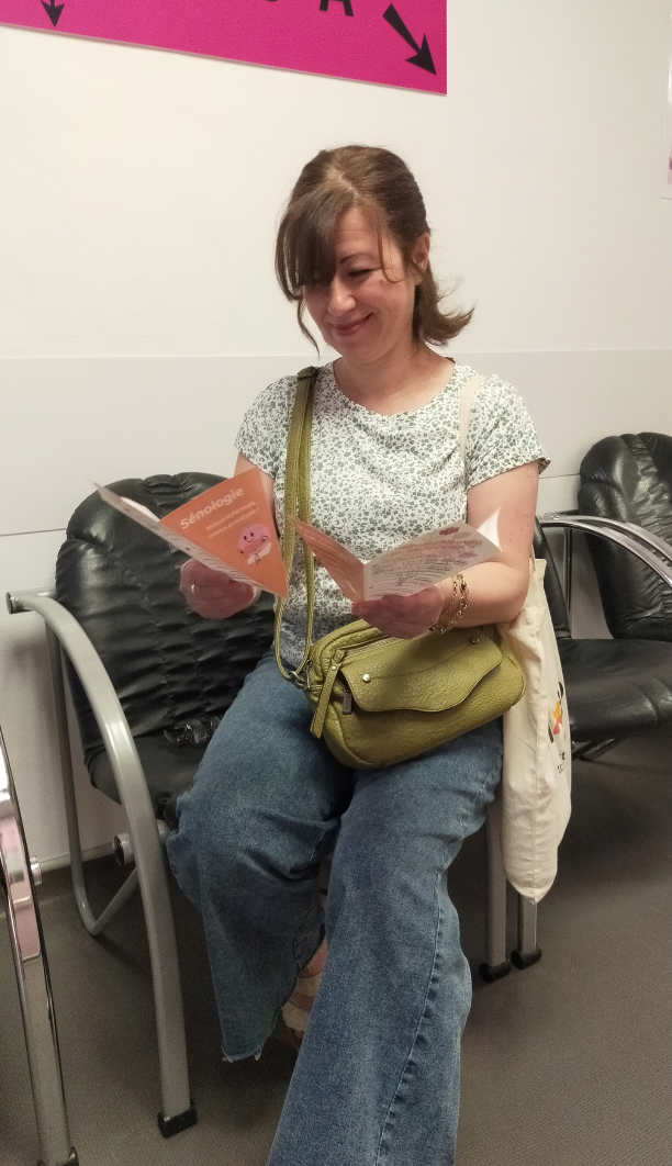
Final concept
Before
The web app: Application for preparing
and personalizing women's imaging exams.
The mascot: Something friendly, unisex,
naive so that everyone can identify
themself to them.
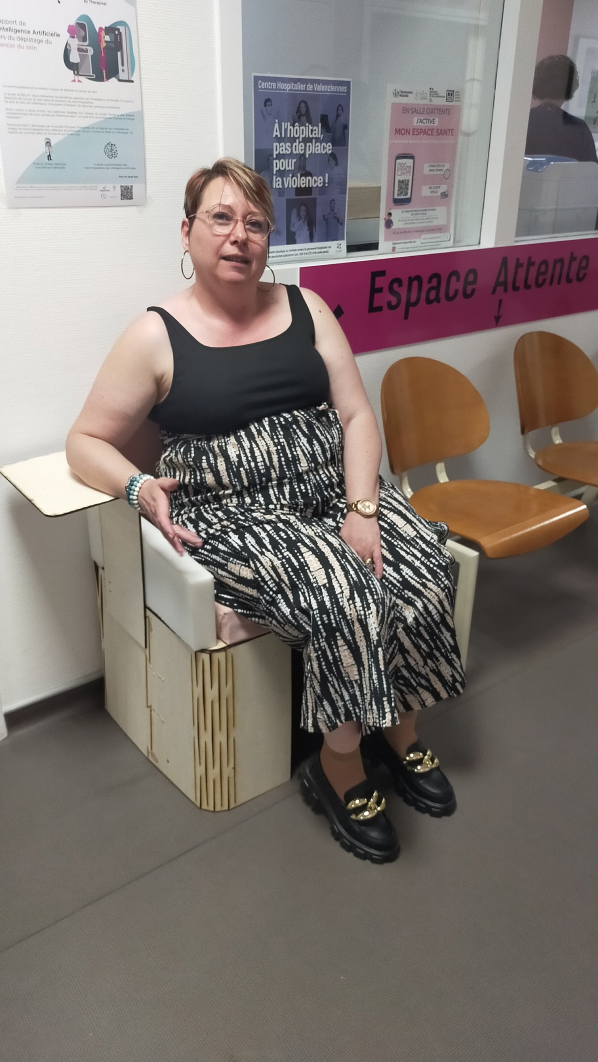
At the hospital
The furniture: Creates unity
in the department and meets
the needs of patients.
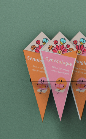
The flyers: Inform and keep patients occupied during waiting times.
Sensory Immersion (Exam Room): Video mapping and ambient audio that soften
the cold medical equipment and alter time perception to reduce anxiety
during the exam.
Opportunities
Personal reflexion
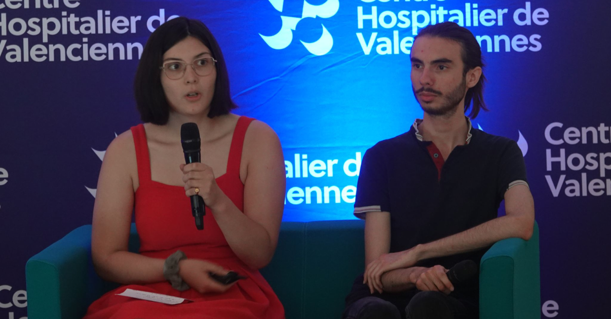
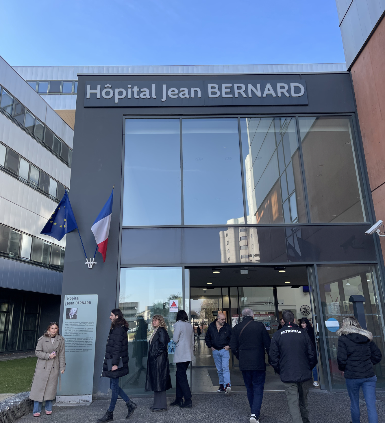
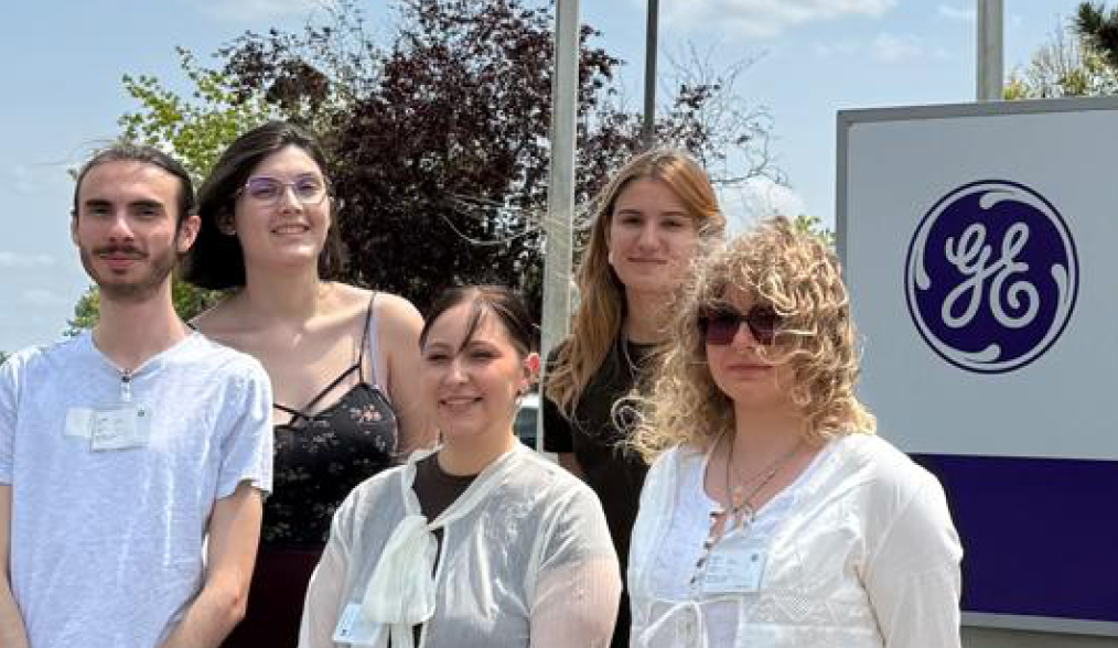
The direct, regular access I had to the women's imaging department meant I could go back to the terrain again and again throughout the project. Beyond the patients, I got to exchange with UX professionals from Hologic, GE Healthcare and Siemens Healthineers, and visit GE's offices in Paris, which gave me a rare, honest look at what UX actually looks like in the medical device industry. I also got to present and defend our work at the 'village santé des femmes,' in front of real stakeholders, a chance
to communicate about the project outside the school context.
I came into this project just after transitioning from product design to UX, thinking I wanted to apply UX research to industrial, consumer-facing products. One of the reasons I chose this project was the access to the field, something I'd already been drawn to
in my product design work and wanted more of. I didn't expect service design to resonate with me as much as it did. What struck me most was realizing that if you run a co-design session well
and really listen, you barely need to be creative yourself, the ideas come from the users, like the two waiting rooms did. This project
is what shaped my professional direction. Right after it, I went on to intern at an industrial design agency, and the contrast between that experience and this one, so social, so public-interest,
is what made me decide to move toward public policy
and impact-driven design.
This project also taught me the importance of having someone
on the team hold the overall, systemic vision, and make sure
it actually gets followed through. We'd developed the different parts of the service too separately, and it was only a few days before the final submission, almost the night before,
that we realized the furniture and the app didn't quite sit together as one coherent experience. I'm also personally not satisfied
with how the furniture turned out against the values we wanted
it to carry. Our product designer was the only one working on it, and I don't think we followed her closely enough to keep
those intentions alive along the way. My first sketch of Chatty
and Bubble, the one you can see in the axis explanation,
wasn't pretty or industrializable, but it captured our intention
far better than what we ended up with.
It's a role I made sure to take on a year later, on S-Cult.

S-cult
X-trim